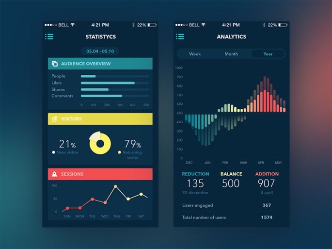
So now, lets talk about one important aspect when building software. We gotta have always in mind that helping the regular user have this intuitive way of using the app-software will lead us to a more successful development.
Here is where the User Interface Design comes to matter.
User Interface (UI) Design focuses on anticipating what users might need to do and ensuring that the interface has elements that are easy to access, understand, and use to facilitate those actions. UI brings together concepts from interaction design, visual design, and information architecture.
Users have become familiar with interface elements acting in a certain way, so try to be consistent and predictable in your choices and their layout. Doing so will help with task completion, efficiency, and satisfaction.
- Input Controls: buttons, textfields, checkboxes, radio buttons, dropdown lists, list boxes, toggles, date field
- Navigational Components: breadcrumb, slider, search field, pagination, slider, tags, icons
- Informational Components: tooltips, icons, progress bar, notifications, message boxes, modal windows
- Containers: accordion

Everything stems from knowing your users, including understanding their goals, skills, preferences, and tendencies. Once you know about your user, make sure to consider the following when designing your interface:
- Keep the interface simple. The best interfaces are almost invisible to the user. They avoid unnecessary elements and are clear in the language they use on labels and in messaging.
- Create consistency and use common UI elements. By using common elements in your UI, users feel more comfortable and are able to get things done more quickly. It is also important to create patterns in language, layout and design throughout the site to help facilitate efficiency. Once a user learns how to do something, they should be able to transfer that skill to other parts of the site.
- Be purposeful page layout. Consider the spatial relationships between items on the page and structure the page based on importance. Careful placement of items can help draw attention to the most important pieces of information and can aid scanning and readability.

- Strategically use color and texture. You can direct attention toward or redirect attention away from items using color, light, contrast, and texture to your advantage.
- Use typography to create hierarchy and clarity. Carefully consider how you use typeface. Different sizes, fonts, and arrangement of the text to help increase scanability, legibility and readability.
- Make sure that the system communicates what’s happening. Always inform your users of location, actions, changes in state, or errors. The use of various UI elements to communicate status and, if necessary, next steps can reduce frustration for your user.
- Think about the defaults. By carefully thinking about and anticipating the goals people bring to your site, you can create defaults that reduce the burden on the user. This becomes particularly important when it comes to form design where you might have an opportunity to have some fields pre-chosen or filled out.
This blog is the most relevant information extracted from the bottom source. Day by day I will try to be eliminating the source words and add my own content but for practice purposes (for now) will be as that.
For instance this is the way I will be working, using the original blogs as layouts for my post develoment. Thanks for the comprehension and all credits to the original authors.
Source: https://www.usability.gov/what-and-why/user-interface-design.html
