--Originally published at A project being made
Sometimes I consider myself as a perfectionist or I think rather that in I’m an indecisive. When is time to plan a design I could take several minutes trying to agree on a template. My problem is concretized in three parts of the design that must be armed with harmony and with the same pattern for the site front page
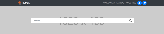
Background search banner
One of the things we want to give more projection to is the search tool, which should be: accessible, visible and efficient. The background I think for this part, is a geometric pattern that will both elegant but simple.
The four pennants
You can see here the very first draft I thought for the four pennants images:
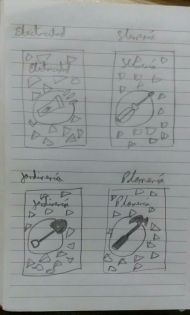 The idea was there but, oh boy, is difficult for me to scratch a good design that matches what I think. Here we have the four main categories of the products to sell, electricity = a pocket lamp, ironwork = a screwdriver, garden = shovel, plumbing = hammer (or Mario, why did not I think about that?). Maybe the titles will not be part of the image. And finally, those little triangle shaped figures randomly placed there will not be part either. They represent the the need for a vectorized pattern that will be in the background, and it will match the one in the background search banner.
Typography and color palette of the site
If the orange does not convince many can be changed by another, what is sought with that color is to highlight the seriousness of others…
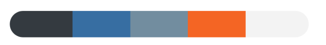
- #343A40, #3A6FA0, #738D9E, #F26531, #F3F3F3
For the typo, maybe the Titillium font will do the job. I will see how the backgrounds pattern stayed first, before making a final decision.

Continue reading "I’m not a designer" →